


Simple but clear signs
One of the benefits of traveling in China, according to Western tourists, is the free access to public toilets.
However, the People's Daily, in a recent editorial, criticized some toilets for their quirky gender signage, which confuses rather than clarifies, and has become a space for innovative marketing, or for designers to show off their talent.
In their search for originality, certain signs have devolved into stylized and highly individualized icons, deviating significantly from their basic function of indicating which is for men and which is for women. Those in a hurry to heed nature's call are subjected to a tough cognitive test that tests their inventive abilities.
As the article notes, the primary objective of public signs is to provide guiding services clearly and efficiently, so that people from various backgrounds can follow them and have their needs satisfied.
Words could have served the goal effectively in a society with general literacy, but pictures are judged more generic, taking into account the challenges that some people may face: illiterates, young children, or foreign visitors.
Thus, signs should, ideally, overcome the limitations inherent in language by offering easy-to-grasp directions to as many users as possible, pictorially and simply. Being artistic, or even intellectual, should be a welcome afterthought.

A RedNote user has posed several pairs of confusing toilet signs.
Many problematic signs achieve the opposite by first stressing the cognitive limits of the general population.
This primordial biological function is represented by a wide range of esoteric indicators.
Geometric signs, for example, can be triangles pointing upwards or downwards (for males).
Some signs feature water drops or slanted lines. Other signs appear to be a pastiche of lines and patterns, as if they were created on the spot by an artist.
Many ancient-style teahouses employed the archaic-style Chinese characters Qian (乾) for men and Kun (坤) for women, making it difficult for anyone lacking a basic understanding of I-Ching.
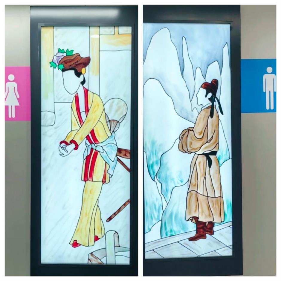
Certain toilets differentiate by employing vignettes of a courtesan and a prince. Due to their long hair and similarly extravagant attire (at least from a contemporary perspective), they are prone to confusion.
There are additional indicators that need knowledge of manga and anime, such as a shield adorned with a superhero for men and a crown adorned with a princess for women.
Occasionally, animals are utilized symbolically: a cartoon monkey in a suit and tie represents man, whereas a rabbit in a bow tie and skirt suggests woman.
In an airport in Chengdu, Sichuan Province, dramatic personae in costumes of local drama are used for different genders.
In an Internet arcade in Guiyang, a swan represents a woman and a toad represents a man, in a generic, if suggestive, usage of the Chinese proverb "a toad wants to eat a swan's meat."
Other cultural elements that have been leveraged include Peking Opera facial makeups, Dunhuang murals, or silhouettes of select animals.
People have even employed beer bottles, depicting beer flowing from one at an angle and cascading vertically. Such overtly explicit designs can raise issues of decency, for instance, in a human contour where a goblet is placed in the lower abdomen, suggesting a woman, in contrast to another with a vertically placed bottle of wine.

Another collection of toilet signs shared by RedNote users.
There is a risk in overgeneralizing some associations. After a high heel and pipe are used to hint at different genders at a toilet in a commercial circle in Beijing, 23 percent of users are reportedly led to the wrong destinations.
Even word signs, poorly designed, might lead to confusion.
To cater to tourists from different countries, toilets in some scenic areas and big cities used signs including English, Chinese, Japanese and Korean. This medley, apparently born of good intention, is poorly designed and amateurishly executed and exacerbated by ill-chosen fonts. Chaos is inevitable.
The designing talent wasted on such misguided signs could be well deployed elsewhere.
According to existing Chinese regulations governing public information signs, there are detailed provisions for graphic signs in public spaces. For instance, a man in trousers signify man, as distinct from a woman in skirts, as they have been widely accepted by the public.
Such a code of signs (trousers/skirts) is compulsory in Germany, where infractions might incur a fine. This is informed by a culturally universal belief: such gender associations could be identified by most cultures in the world.
In Singapore, all public signs must pass elderly cognitive tests before being used formally.
While current regulations allow for some original designs, they must be guided by general cognitive abilities and common sense to ensure that creativity results in aesthetically appealing solutions without compromising their practical value in providing effective guidance.
There are positive examples of creativity, in public toilets in West Lake in Hangzhou, capital of Zhejiang Province, where gender is designated by male and female silhouettes in the style of Chinese ink-brushes, easily identifiable, and in an aesthetically appealing setting.
Signs at a toilet in Hangzhou of Zhejiang Province.
Those artsy designers should learn from this example.
According to State Council guidelines on improving public services in 2023, they explicitly prohibit excessively ornamental and ornate designs, signaling a clear intention to redress the tendency to overdesign in public spaces that are divorced from their expressed use.
So, although in China these are recommended guidelines, the onus is on urban managers, through systemic regulations and guidance, to translate such recommendations into consensus from a practical perspective.
A huge amount of public resources has been committed to the making of public toilets, and easily recognizable signs would go a long way in making them fully used. That is what a people-centric city should care about.